An impressive program page for affiliates may increase significantly the conversion rate, i.e. transform potential affiliates into affiliates.
Even so, affiliate managers often focus on the most on affiliate program structure, and miss out on the affiliate program page. Those pages help attract new partners.
Check out these 10 awesome examples of affiliate program landing pages and see what you can learn from them!
What is an affiliate program page?
An affiliate program page (also known as an “affiliate program landing page”) is a web page designed specifically to present the affiliate program’s details and direct potential affiliates to the affiliate sign-up portal. An affiliate landing page includes program information, benefit highlights, visual content, and an affiliate sign-up page.
The affiliate program page serves as a gateway for individuals or businesses to be a part of your affiliate program.
What makes a program page compelling?
A compelling landing page provides necessary information for your potential affiliates and makes them highly evaluate your brand and affiliate program.
A successful landing page in affiliate marketing may need some testing and revision. However, there are cornerstones that contribute to a convertible affiliate landing page:
- Compelling Visuals: The primary image or video is the first thing visitors notice. It should be attention-grabbing and showcase the product or service in action.
- Clear Call to Action: The CTA button is the focal point for visitor interaction. Avoid distracting secondary links that might lead visitors away from the intended action.
- Concise Value Proposition: Clearly communicate the benefits of your offer. Make sure they are highlighted and set in the important position.
- Social Proof: Existing testimonials and reviews can build trust among visitors. It is best to insert a link navigating to that affiliate’s site, or showcase some of their promotional posts – but it would never take the spotlight of the CTA.
- Mobile Optimization: Mobile-first is the price of Google these days. Make sure your page loads quickly on all devices, and information is well laid out in different screen sizes.
- Frequently Asked Questions: There might be many questions around your affiliate program, so including them gives your page a better SEO.
However, the priority is to make your page harmonized and appealing for affiliate’s sign-up.
Therefore, It is unnecessary to have all of the above on your page.
10 examples of affiliate program pages
Shopify
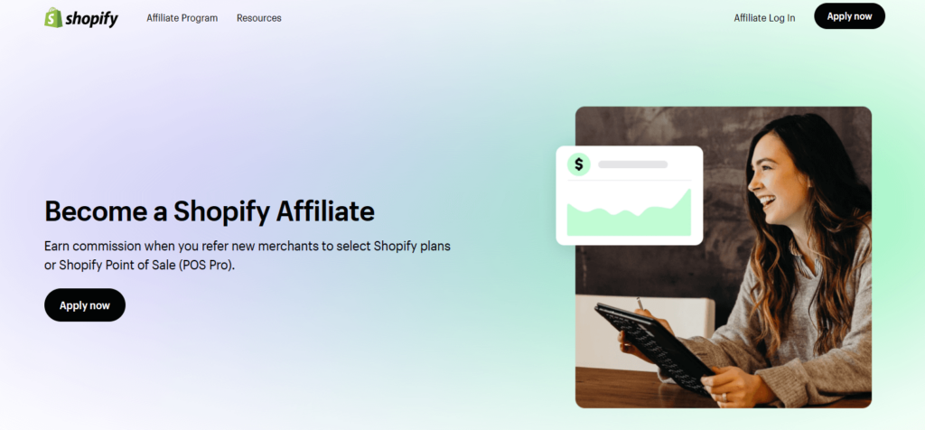
Shopify’s landing page is very simple and specifies the package by which you can earn by referring new users.
What to learn from Shopify:
- Simply and concise information
- Dedicated FAQs sections
- Video testimonials from top affiliates
Relevant: 08 Partner Pages Examples
TinyIMG
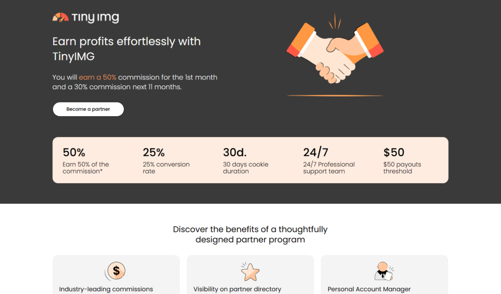
TinyIMG’s landing page specifies the benefits of being its affiliate. Visitors may know if they want to join the program without further research.
What to learn from TinyIMG:
- Disclosure of program information
- Benefits showcase
- Harmonized color template and well-structured web design
Canva
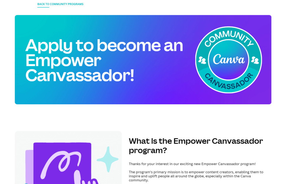
Canva affiliate program goes under a specific name: Empower Canvassador program. The landing page is present in the form of a FAQs list.
What to learn from Canva:
- Special design and concept for the whole program
- Clean layout focusing on informative sections
- FAQs rich info facilitate page SEO
YOU HAVEN’T YET RUN ANY AFFILIATE PROGRAM?
FatJoe
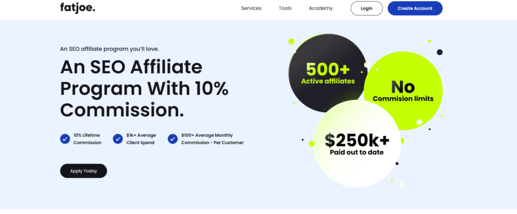
FatJoe SEO clarifies the credibility and the scale of its affiliate program. Currently, they have over 500+ affiliates & $250,000 paid out to date.
What to learn from FatJoe
- Short-form piece of information
- Specify the products that can be promoted
- Explain how the program works, including sign-up and earning tracking
Notion
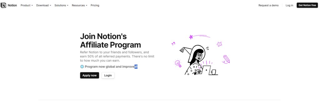
Notion’s landing page is simply so good. It is nothing but beautiful and informative. Honestly, there they did so well with everything on this page.
What to learn from Notion:
- A step-by-step guide to registration for the program
- How much you could earn via program
- Attention to design with iconic Notion drawings
HotJar

The Hotjar program page stands out with its vibrant and contemporary design. All key details are shown specifically, including benefits, tailored according to the type of affiliate, alongside a testimonials segment.
What to learn from HotJar:
- Applications will be reviewed within two days.
- Make it clear that the program will work best for SaaS companies.
- Gain exclusive access to the latest features for trial before general release.
Revolut
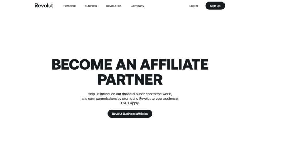
The Revolut program page has a very straightforward and highlighted call to action.
Yet it effectively conveys the essential information below.
What to learn from Revolut:
- Not a lot of content, but what’s there works well to convince people to sign up.
- Company stats are presented in a way that grabs attention and strengthens the sense of credibility.
- Rich FAQs
ExpressVPN
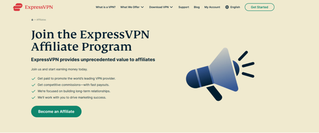
The ExpressVPN program landing page has a good layout and a bold call to action.
What to learn from ExpressVPN:
- Clear CTA button “Become an Affiliate”
- Good-looking images or graphics match the brand and show that the page is professional.
- The page has a responsive design – looks good and works well on any screen size.
Ghost
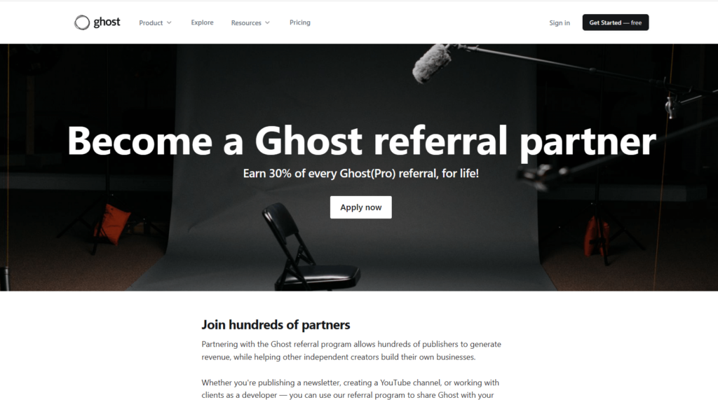
Everyone can apply to be a Ghost partner, but because they get a lot of applications, only a few are accepted. We like this because it means they focus on quality rather than quantity, ensuring everyone gets a fair share.
Things you might want to copy:
- Easy step-by-step process
- Tools and resources for promotion available to all affiliates
- Dashboard access to track links, conversions, and sales”
Surfe
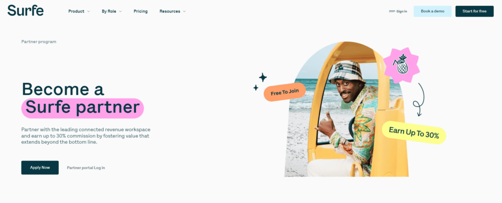
The Surfe affiliate landing page has a happy and relaxed look, matching the product’s vibe well. We like how it talks about the company’s mission, showing why it matters to customers and what being an affiliate involves.
What to learn from Surfe:
- Using relaxing pastel colors and drawings to make the page feel welcoming.
- Offer various programs (with different rules) so affiliates can choose a suitable one.
- Showing community testimonials helps build trust with potential affiliates.
Don’t forget to customize your program page!
Don’t forget to make your program page unique! After seeing these amazing examples, it’s important to personalize your page to match your brand and what you offer.
Add your own style and tell people why they should partner with you. Making your page special will help you stand out in affiliate marketing. So, use these examples as inspiration, but remember to add your own touch. Have fun customizing!

Dan Muller
I have been working in marketing for four years, passionate about creative writing and copy writing. Love to be alone at watersides, sip coffee, play games or read anything that is thought provoking.